Every company logo holds a life philosophy within.

Giovanni Frino

A slight 3D effect recalls the art of chalk itself. The A is yellow and does not have a parallel line to underline the artistic skills of Gessarte, which is able to take care of the most difficult works.
The dandelion represents the delicacy, the sweet lines of the text communicate the sweetness and care of the beauty center and its owner who takes great care of its customers.
This new company needed a modern and linear design, but at the same time eye-catching and based on the fact that the company's many activities from there the triangle with a thousand colors.
The semicircles represent the magnetic waves that are inherent to the type of products marketed by GiEdy Technics. The green and gold are to communicate a sophisticated level of products.
This logo is totally inspired by its owner, a laid and practical person who has no frills, gets the job done with maximum efficiency and functionality. To emphasize the whole 4 strips enclosed in a square, one of the simplest geometric shapes. All the text "tolotti" is built with rectangles.
This simple logo is aligned with the same name that was intended to be a catchy name and immediately become familiar to those who heard it. ticino is written in small while WEB in large, this is to emphasize modernity and bring back to the writing of code that just does not respect the normal formality but aims at practicality and efficiency.
The logo is built with fundamental geometric shapes to emphasize the engineering spirit of the owner and his company.
This logo represents the journey, all the letters are linked together where the red accent represents the arrival. The inspiration came from both the owner who is a traveler and the activity itself which is to promote motorcycle tours.
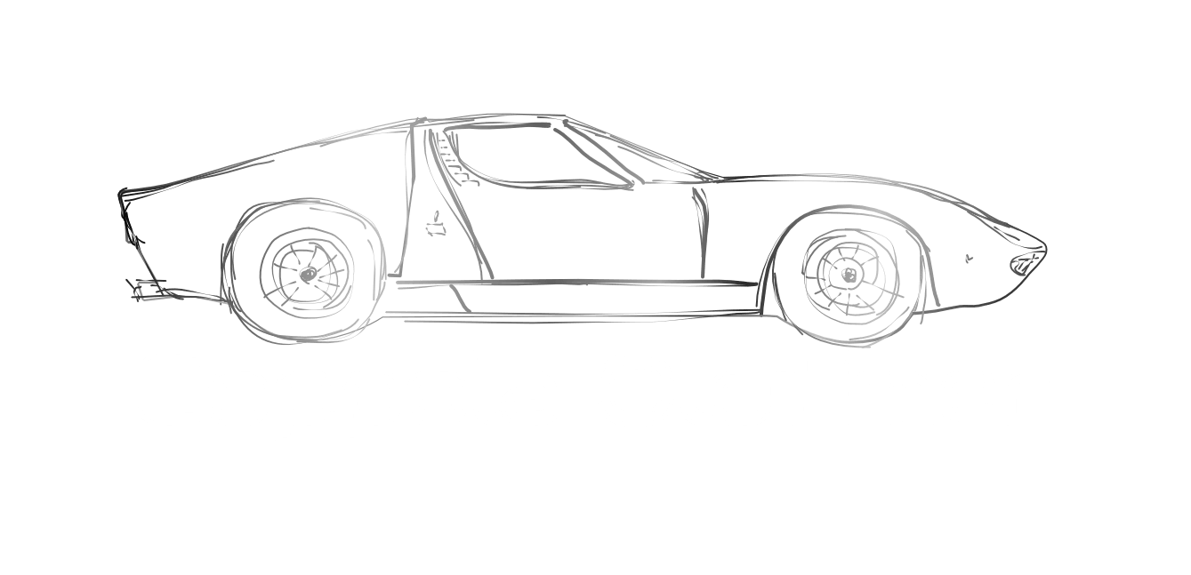
This logo is of a 40-year old company, hence the silhouette of a classic car historical but at the same time modern as to emphasize the transition from the past to the future of this company. The inspiration and layout came from the owner himself.
Ghielmini has been making radio installations for many years, very well known in his area, and required an ancient but at the same time modern design. From there this fusion between the old and the modern in the character of the logo.

At Swiss Online Services we develop advertising graphics at the request of our customers. From logos to the entire company image, brochures, posters, flyers, etc. 

"Image encapsulates the intention of a company.”

- Giovanni Frino -

contact